In this guide, you’ll discover the principles behind complementary colors and learn how to utilize them to create stunning visuals with our complementary color generator. Get ready to unlock a world of colorful possibilities for your next creative project.
Complementary Color Generator
Understanding Complementary Colors: A Guide
Have you ever wondered why certain color combinations catch your eye? The secret lies in complementary colors. As an artist or designer, understanding how to effectively use complementary colors can elevate your work to new heights. These color pairs, situated opposite each other on the color wheel, create a striking visual contrast when used together. By harnessing the power of complementary colors, you can add depth, vibrancy, and balance to your designs.
Table of contents
What Are Complementary Colors?
Complementary colors are pairs of hues that sit opposite each other on the color wheel. These dynamic duos create a striking visual contrast when used together, making designs pop and grab attention. Understanding complementary colors is essential for artists, designers, and anyone looking to harness the power of color theory.
The Science Behind Complementary Colors
At its core, the concept of complementary colors is rooted in how our eyes perceive light. When two complementary colors are placed side by side, they create the strongest contrast possible. This is because our eyes are naturally drawn to this pairing, as it provides maximum differentiation between the two hues.
Common Complementary Color Pairs
Some well-known complementary color combinations include:
- Red and Green
- Blue and Orange
- Yellow and Purple
These pairings exemplify the vibrant interplay between warm and cool tones, creating a balanced yet energetic visual effect.
Practical Applications
Understanding complementary colors can elevate various creative endeavors:
- In graphic design, complementary colors can make logos and advertisements more eye-catching.
- Painters often use complementary colors to create depth and visual interest in their artwork.
- Interior designers utilize complementary color schemes to create dynamic, harmonious spaces.
By mastering the art of complementary colors, you can enhance the visual impact of your projects and create more engaging, memorable designs.
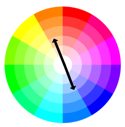
The Color Wheel and Complementary Colors
Understanding the Color Wheel
The color wheel is a circular arrangement of hues that serves as a fundamental tool for understanding color relationships. It consists of primary, secondary, and tertiary colors arranged in a specific order. This visual representation helps artists, designers, and color enthusiasts grasp the connections between different shades and tones.
Identifying Complementary Colors
Complementary colors are pairs of hues that sit opposite each other on the color wheel. These contrasting pairs create a striking visual impact when used together. The most common complementary color pairs are:
- Red and green
- Blue and orange
- Yellow and purple
When placed side by side, complementary colors appear more vibrant and intense, creating a dynamic visual effect that can draw attention and create balance in compositions.
The Science Behind Complementary Colors
The concept of complementary colors is rooted in color theory and human perception. Our eyes naturally seek visual balance, and complementary colors provide this equilibrium. When we view complementary colors together, our eyes blend them, creating a neutral gray. This phenomenon, known as simultaneous contrast, explains why complementary colors appear more vibrant when used in combination.
Understanding the color wheel and complementary colors is essential for anyone working with visual design, art, or color theory. By mastering these concepts, you can create more harmonious and visually appealing compositions in various fields, from graphic design to interior decorating.
How to Find Complementary Colors
Finding complementary colors is an essential skill for designers, artists, and anyone interested in color theory. By understanding the process, you can create visually striking combinations that enhance your projects.
Using the Color Wheel
The color wheel is your go-to tool for identifying complementary colors. To find a color’s complement:
- Locate your base color on the wheel.
- Draw an imaginary line straight across the center.
- The color opposite your base color is its complement.
For example, red’s complement is green, while blue’s is orange.
Digital Color Pickers
In the digital age, numerous online tools and software applications can help you find complementary colors effortlessly. These color pickers often provide:
- Instant complementary color suggestions
- RGB and hexadecimal color codes
- Additional harmonious color schemes
- Observing Nature
Nature offers abundant examples of complementary color pairings. Take note of vibrant flowers, colorful birds, or stunning sunsets to inspire your color choices. These natural combinations can provide unique and harmonious color ideas for your projects.
By mastering these techniques, you’ll be well-equipped to identify and utilize complementary colors effectively in your designs, artwork, or home decor projects.
Using Complementary Colors in Design
Creating Visual Impact
Complementary colors are a powerful tool in design, offering striking contrasts that can make your work truly pop. When used strategically, these color pairs can create a vibrant, eye-catching effect that draws the viewer’s attention. For instance, pairing a deep blue with a warm orange can create a bold, energetic look perfect for sports branding or adventure-themed designs.
Balancing Your Palette
While complementary colors provide strong visual impact, it’s crucial to use them judiciously. Too much contrast can be overwhelming or jarring to the eye. A good rule of thumb is to use one color as the dominant hue and its complement as an accent. This approach creates a harmonious balance while still leveraging the dynamic tension between the two colors.
Practical Applications
In web design, complementary colors can be used effectively for call-to-action buttons, highlighting important information, or creating visual hierarchy. For example, a green “Buy Now” button on a predominantly red website can stand out dramatically. In interior design, a room with cool blue walls might benefit from warm orange accents in throw pillows or artwork, creating a lively yet balanced atmosphere.
Remember, the key to successfully using complementary colors lies in finding the right balance and application for your specific design needs. Experiment with different shades and proportions to achieve the desired effect in your projects.
Complementary Color Combinations to Try
Experimenting with complementary colors can lead to striking and harmonious designs. Here are some classic pairings to inspire your next project:
Red and Green
The quintessential holiday duo, red and green create a vibrant contrast that’s both energetic and balanced. Use this combination to evoke feelings of warmth and tradition, or to make key elements pop in your design.
Blue and Orange
This pairing combines the calming effect of blue with the energetic warmth of orange. It’s perfect for creating designs that are both eye-catching and approachable. Consider using blue as your primary color with orange accents for a balanced look.
Purple and Yellow
For a regal yet playful combination, try purple and yellow. This pairing can add depth and sophistication to your designs while maintaining a sense of whimsy. Use purple as a dominant color with yellow highlights for an elegant effect.
Teal and Coral
This modern twist on complementary colors offers a fresh, tropical feel. Teal’s cool serenity balances perfectly with coral’s warm vibrancy. This combination works well in both digital and print designs, especially for brands aiming for a contemporary, approachable aesthetic.
Remember, the key to using complementary colors effectively is balance. Experiment with different shades and proportions to find the perfect combination for your project.
Conclusion
As you explore the world of complementary colors, remember that this powerful tool can elevate your designs to new heights. By utilizing a complementary color generator, you’ll effortlessly discover harmonious color pairings that captivate your audience. Experiment with various shades and tints to find the perfect balance for your project. Whether you’re a seasoned designer or a novice enthusiast, mastering complementary colors will undoubtedly enhance your creative arsenal. Embrace the vibrant possibilities that await you, and let your imagination soar as you harness the dynamic energy of complementary hues. Your newfound knowledge will transform your approach to color theory and design for years to come.