
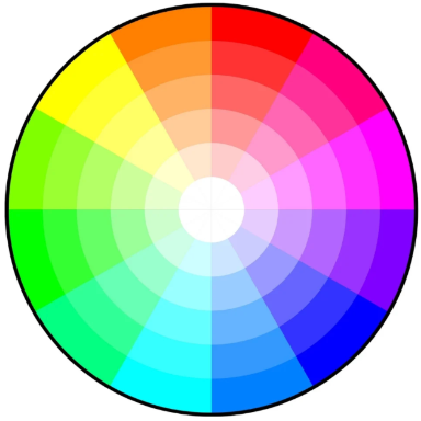
This color wheel circular chart arranges hues in a logical sequence, allowing you to identify complementary and opposing colors with ease. By mastering the color wheel, you’ll gain invaluable insights into creating harmonious color schemes for your design projects.
Color Wheel Chart
Selected Color: None
Favorite Colors
Understanding Color Theory: Using the Color Wheel to Pick Opposites and Complements

As you delve into the world of color theory, you'll discover a powerful tool for understanding and utilizing color relationships: the color wheel chart. Whether you're a graphic designer, artist, or interior decorator, understanding how to leverage opposite and complementary colors can elevate your work to new heights. In this article, you'll explore the fundamentals of the color wheel and learn how to apply its principles to your creative endeavors.
The Basics: What is Color Theory?
Color theory is the fundamental framework that helps us understand how colors interact and relate to one another. At its core, this theory provides a systematic approach to selecting and combining colors for various applications, from art and design to marketing and branding.
The Color Wheel: A Visual Guide
The color wheel is the cornerstone of color theory, offering a visual representation of color relationships. This circular chart displays the spectrum of hues in a logical sequence, making it easier to pick complementary and opposite colors. The wheel typically includes primary colors (red, blue, yellow), secondary colors (green, purple, orange), and sometimes tertiary colors.
Hot and Cold: Temperature in Color
Colors are often categorized as "hot" or "cold," adding depth to our understanding of their emotional impact. Warm hues like reds, oranges, and yellows evoke energy and excitement, while cool blues, greens, and purples suggest calmness and serenity. This temperature concept is crucial when creating balanced color schemes.
Complementary and Opposite Colors
One of the most powerful applications of color theory is the use of complementary and opposite colors. Complementary colors sit across from each other on the color wheel and create striking contrasts when used together. For example, blue and orange are complementary, as are red and green. Understanding these relationships allows designers to create visually appealing and harmonious color schemes that stand out and capture attention.
Using the Color Wheel to Pick Opposite Colors
The color wheel is an invaluable tool in color theory, helping you pick opposite and complementary hues with precision. Understanding how to use this circular chart can elevate your design skills and create visually striking compositions.
Identifying Opposite Colors
To find opposite colors on the wheel, simply locate a hue and draw an imaginary line straight across to the other side. These contrasting pairs, also known as complementary colors, create a bold, vibrant effect when used together. For example, blue is opposite orange, while purple sits across from yellow.
The Theory Behind Opposites
Color theory explains why opposite hues work so well together. These pairings create maximum contrast, making each color appear more intense when placed side-by-side. This principle is often used in art and design to make elements stand out or create visual interest.
Hot and Cool Contrasts
When selecting opposites, consider the temperature of colors. Pairing a hot color like red with its cool opposite, green, can create a dynamic visual balance. This contrast in temperature adds depth and energy to your color scheme.
Remember, while the color wheel helps you pick complementary pairs, the key is to use them thoughtfully. Experiment with different proportions and shades to find the perfect balance for your project.
Understanding Complementary Colors
Complementary colors are opposite hues on the color wheel, creating a striking visual contrast when used together. These color pairs are essential to understand in color theory, as they can create dynamic and eye-catching designs.
The Science Behind Complementary Colors
When you pick complementary colors, you're selecting hues that are directly across from each other on the color wheel. This opposition creates a natural balance, as each color enhances the intensity of its complement. For example, red and green, blue and orange, or purple and yellow are classic complementary pairs.
Practical Applications in Design
Understanding how to use complementary colors can elevate your design work. These color combinations are often used to create emphasis or draw attention to specific elements. In graphic design, you might use a complementary color scheme to make a logo stand out against a background. In interior design, complementary colors can add a pop of interest to a room.
Hot Tips for Using Complementary Colors
- Use one color as the dominant hue and its complement as an accent for balance.
- Experiment with different shades and tints of complementary pairs to find the perfect match.
- Be cautious with large areas of pure complementary colors, as they can be overwhelming.
- By mastering the use of complementary colors, you'll enhance your ability to create visually appealing and harmonious designs across various mediums.
Finding Color Harmonies and Schemes
Understanding color theory is essential when it comes to picking complementary and opposite colors on the color wheel. By mastering these concepts, you can create visually appealing designs that capture attention and evoke specific emotions.
Complementary Colors
Complementary colors sit directly across from each other on the color wheel. These pairings create a vibrant, high-contrast look that can make your designs pop. For example, blue and orange or purple and yellow are complementary pairs. When used together, they create a bold, eye-catching effect that's perfect for making key elements stand out.
Analogous Colors
Analogous color schemes use colors that are adjacent to each other on the wheel. This creates a harmonious, cohesive look that's pleasing to the eye. For instance, a combination of yellow, yellow-green, and green would be considered analogous. These schemes are often found in nature and can create a sense of calm and unity in your designs.
Triadic Color Schemes
To create a balanced yet vibrant look, consider using a triadic color scheme. This involves picking three colors that are evenly spaced around the color wheel. Red, blue, and yellow form a classic triadic scheme. This approach offers more variety than complementary pairs while maintaining a sense of harmony.
Remember, understanding color theory allows you to create designs that are not only aesthetically pleasing but also effectively communicate your message. Whether you're aiming for a hot, energetic look or a cool, calming vibe, the color wheel is an invaluable tool in your design arsenal.
Hot and Cold Color Combinations
Understanding color theory is essential when it comes to picking complementary and opposite hues on the color wheel. One of the most striking ways to create visual interest is by pairing hot and cold colors.
The Power of Temperature Contrast
Hot colors, like reds, oranges, and yellows, evoke warmth and energy. On the opposite end of the spectrum, cool colors such as blues, greens, and purples convey calmness and serenity. When used together, these contrasting temperatures can create dynamic and eye-catching designs.
Practical Applications
To effectively use hot and cold color combinations:
- Choose a dominant temperature: Decide whether you want your design to feel primarily warm or cool.
- Select complementary pairs: Pick opposites on the color wheel, such as red (hot) and blue-green (cold).
- Balance intensity: Adjust the saturation and brightness to achieve harmony.
Remember, the theory behind these pairings isn't just about aesthetics. Hot and cold color combinations can also influence mood and perception, making them powerful tools in both art and marketing.
By mastering the art of temperature contrast, you'll be able to create designs that are visually striking and emotionally impactful. Whether you're designing a website, crafting a brand identity, or painting a masterpiece, understanding how to leverage hot and cold colors will elevate your work to new heights.
Conclusion
As you explore the color wheel and apply color theory principles to your designs, remember that understanding complementary and opposite colors is just the beginning. The color wheel serves as a powerful tool to guide your creative decisions, but don't be afraid to experiment beyond its boundaries. By mastering the fundamentals of color relationships, you'll develop an intuitive sense for creating harmonious and impactful color schemes. Whether you're a professional designer or an enthusiastic hobbyist, the knowledge you've gained about the color wheel will undoubtedly enhance your artistic endeavors. Continue to practice and refine your color choices, and watch as your designs come to life with newfound vibrancy and balance.
You must be logged in to post a comment.